12.13 Exercises

Selected answers are available in Sect. D.12.

Exercise 12.1 A study (Henderson and Velleman 1981) recorded the number of cylinders in many models of cars (Table 12.7). The number of cylinders is quantitative discrete, but with so few different values, this variable could be plotted with some of the graphs used for graphing qualitative data.

For these data:

  1. Produce a dot chart.
  2. Produce a histogram.
  3. Produce a bar chart.
  4. Produce a pie chart.
What graph do you think is best? Why?
TABLE 12.7: The number of cylinders in cars in a study
Number of cylinders Number of cars
4 11
6 7
8 14

Exercise 12.2 A study of lime trees (Tilia cordata) recorded these variables for 385 lime trees in Russia (Schepaschenko et al. 2017; Dunn and Smyth 2018):

  • the foliage biomass, in kg;
  • the tree diameter (in cm);
  • the age of the tree (in years); and
  • the origin of the tree (one of Coppice, Natural, or Planted).
The purpose of the study is to estimate the foliage biomass from the other variables. What graphs would be useful?
Exercise 12.3 In a study of the influence of using ankle-foot orthoses in children with cerebral palsy (Swinnen et al. 2017), the data in Table 11.2 describe the 15 subjects. (GMFCS is an ordinal variable used to describe the impact of cerebral palsy on their motor function: the Gross Motor Function Classification System.) Sketch some graphs to explore the relationships between these variables.

Exercise 12.4 A study of fertilizer use (Lane 2002; Dunn and Smyth 2018) recorded the soil nitrogen after applying different fertilizer doses. These variables were recorded:

  • the fertilizer dose, in kilograms of nitrogen per hectare;
  • the soil nitrogen, in kilograms of nitrogen per hectare; and
  • the fertilizer source; one of ‘inorganic’ or ‘organic.’
What graphs would be useful for understanding the data?

Exercise 12.5 A survey of voice assistants (e.g. Amazon Echo; Google Home; etc.) conducted by Nielsen asked respondents to indicate how they used their voice assistant; options given were:

  • Listening to music;
  • Search for real-time info (e.g. traffic; weather);
  • Search for factual info (e.g. trivia; history);
  • Listen to news;
  • Chat with voice assistant for fun;
  • Use alarms, timer.
What would be the best graph for displaying respondents answers? Would a pie chart be suitable? Explain your answer.
Exercise 12.6 A study of athletes at the Australian Institute of Sport (AIS) measured numerous physical and blood measurements from high performance athletes (Telford and Cunningham 1991). The graph in Fig. 12.40 compares the heights of females in two similar sports4: basketball and netball. How would you describe the heights of the athletes in the two sports?
The heights of female basketball and netball players attending the AIS

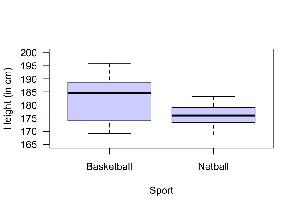
FIGURE 12.40: The heights of female basketball and netball players attending the AIS

Exercise 12.7 A study of noisy miners (a small Australian bird) counted the number of noisy miners and the number of eucalyptus trees in random quadrats (Maron 2007; Dunn and Smyth 2018). Critique the graph of the data (Fig. 12.41).
The number of noisy miners and the number of eucalyptus trees

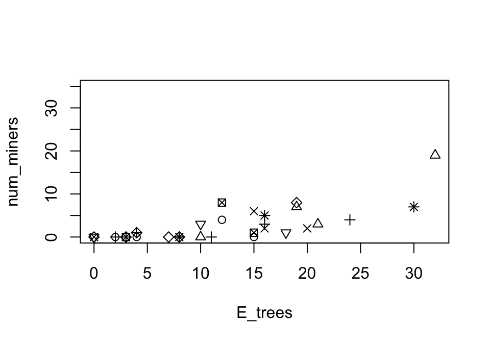
FIGURE 12.41: The number of noisy miners and the number of eucalyptus trees

Exercise 12.8 A study of 173 female horseshoe crabs (Brockmann 1996; Dunn and Smyth 2018) recorded, among other things, the colour of the carapace (one of ‘Light medium,’ ‘Medium,’ ‘Dark medium’ or ‘Dark’) and the condition of the carapace (one of ‘Both OK,’ ‘One OK,’ ‘None OK’). Critique the scatterplot (Fig. 12.42) used to explore the data.
A scatterplot of the colour of female horseshoe crabs and the condition of their spines. There are no missing values.

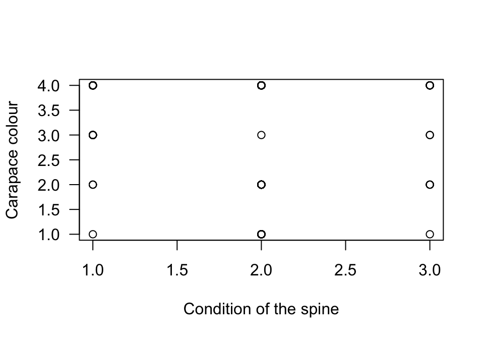
FIGURE 12.42: A scatterplot of the colour of female horseshoe crabs and the condition of their spines. There are no missing values.

Exercise 12.9 A study (Danielsson et al. 2014) examined the change in MADRS (a quantitative scale measuring level of depression) and treatment group (whether each person was treated using: exercise; body awareness; or advice).

  1. What is the response variable?
  2. What is the explanatory variable?
  3. What graphs would be useful for exploring the data and the relationships of interest?
Exercise 12.10 In a study of the temperature in offices, Paul and Taylor (2008) compared the temperature in three offices (during working hours) at Charles Sturt University (Australia); the data are summarised in Table 12.8. Using this information, draw the boxplot comparing the three offices. What do we learn from this graph?
TABLE 12.8: A summary of the temperature (in degrees C) in three offices at CSU during working hours according to current smoking status
Office A Office B Office C
Mean 24.1 25.3 25.7
Minimum 16.4 15.9 20.1
\(Q_1\) 22.8 23.8 24.6
Median 24.4 25.5 26.1
\(Q_3\) 25.5 26.9 27.2
Maximum 27.4 31.0 30.3
Exercise 12.11 A study of high-performance athletes at the Australian Institute of Sport (AIS) (Telford and Cunningham 1991) recorded numerous variables about athletes. A plot for the sports played by the athletes is shown in Fig. 12.43. How would you describe the data: Left skewed, right skewed, approximately symmetrical? Or something else?
Sports played by athletes in the AIS study

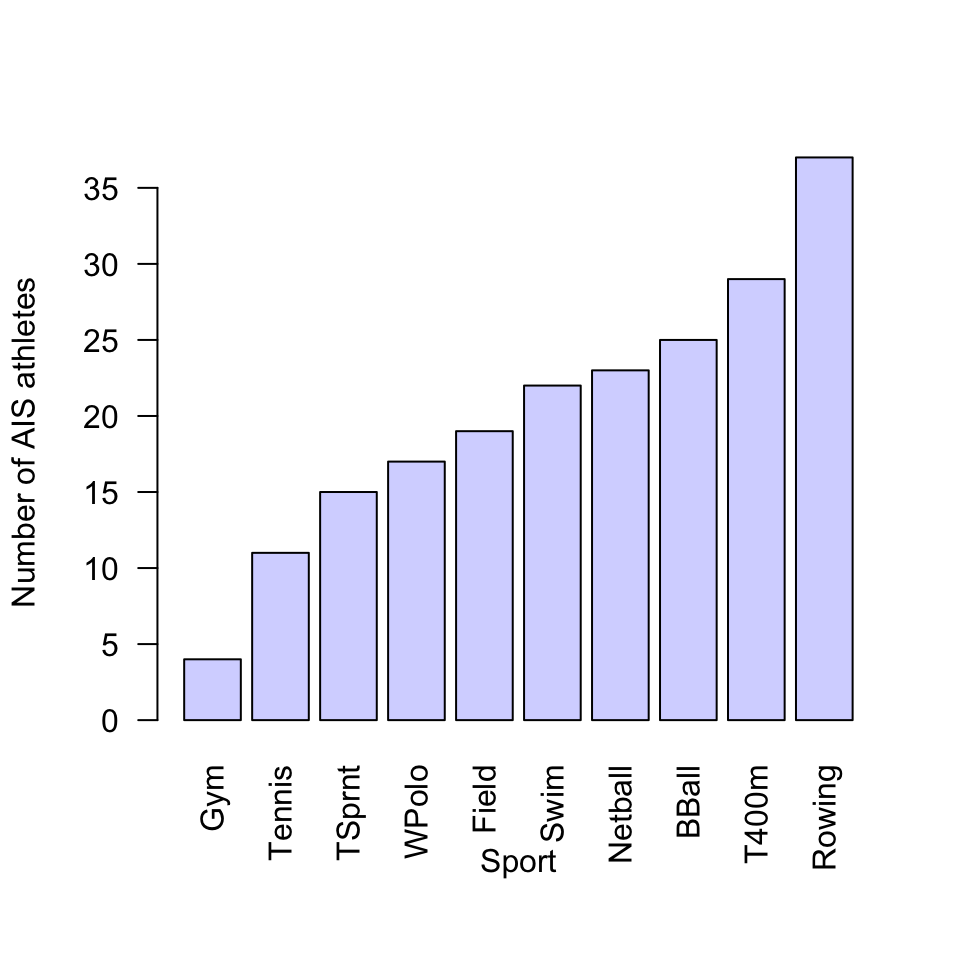
FIGURE 12.43: Sports played by athletes in the AIS study


  1. Netball was derived from basketball: https://en.wikipedia.org/wiki/Netball#History↩︎